
If you run an ecommerce store, increasing your conversion rate is a key revenue driver for your business. It ensures that traffic turns into a profit on your bank account.
And today, I am going to show you exactly how you can convert more visitors into paying customers on your ecommerce website.
So if you want to understand:
- What conversion rate optimisation is,
- How you can calculate conversion rates,
- What the average ecommerce conversion rate is, or
- How you can increase your conversion rate,
then you’re in the right place.
Let’s dive right in!
What is Ecommerce Conversion Optimisation?
The Conversion Rate is the percentage of your website visitors who complete a desired action.
The “conversion” is the action that you want your visitors to take, e.g.:
- Signing up for a newsletter.
- Registering a user account.
- Adding a product to their cart.
- Buying a product.
- etc.
Conversion Optimisation is the practice of maximising the number of visitors that take the desired action.
When running an ecommerce site, you generally want to increase the number of visitors buying one of your products.
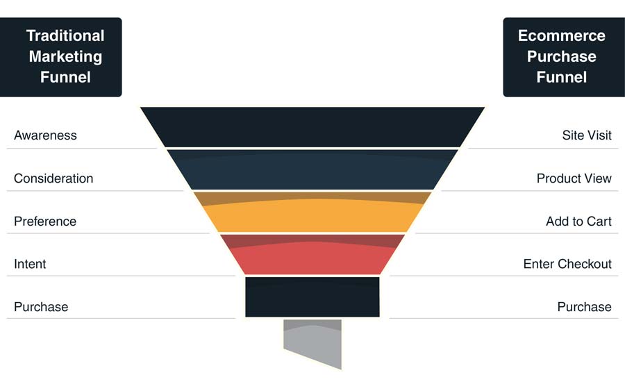
An example of a classic conversion funnel looks like this:
Now, here’s the caveat: Turning more visitors into customers can result in more revenue for your business.
But that’s not always the case.
Because if you lower your product prices by 90%, your conversion rates are likely to surge. But you will end up making less money and profits.
So what should you do?
You should still keep an eye your conversion rates. They are often easier to increase than your traffic (I’ll show you how to do it in a second). But don’t obsess over them as a single metric. You also need to keep your price and margin targets in mind.
How to Calculate the Conversion Rate
One of the biggest questions many have is:
“How do I calculate the conversion rate of my ecommerce business?”
Thankfully, it’s an easy question to answer. You take the number of users who took the desired action and divide it by your total number of visitors. Conversion rates are expressed as a percentage:
Conversion Rate % = (Total Number of Conversions ÷ Total Number of Visitors) x 100
Let’s say you sold 2,000 coffee mugs and had 100,000 users visiting your online store. Your conversion rate would be at 2%.
Tools like Google Analytics allow you to set up conversion funnels to track your conversion rates over time.
Tip: Use my free conversion rate calculator to work out your conversion rate.
Which brings us to the next question:
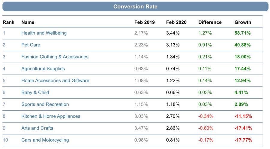
What is the Average Conversion Rate for Ecommerce Sites?
The average conversion rate of an ecommerce site is at around 1-3%.
In fact, the latest data from IRP Commerce show that conversion rates range between 0.6 and 3.4%, depending on your industry.
What does that mean for you?
You should aim to optimise your conversion rates towards the upper limit of 3%.
More specifically, you want to beat the average of your industry. Especially if you’re on a low budget. Because it allows you to get more sales from the existing traffic you already have on your site.
For example, let’s say your online store has 100,000 visitors and 2% of them convert and buy your products. To increase your sales, you have two options: Either you get more visitors on your site, e.g., by spending $$$ on ads; or you focus on increasing your conversion rate. I know what I would choose for my business! 😉
With that in mind, let’s get to the tips to help you optimise your ecommerce conversions.
How to Increase Your Ecommerce Conversion Rate
So you have an ecommerce site. You have visitors and know your current conversion rate.
How do you optimise it?
Here are 11 proven tips that will help you beat your competition:
- Start with Split (A/B) Testing
- Use High-Quality Images
- Explain Your Product’s Value
- Use Prominent CTAs
- Answer Frequently Asked Questions
- Simplify Your Checkout Process
- Use Odd Pricing
- Deploy Price Anchoring
- Make Use of Customer Reviews
- Use Personalisation
- Use Urgency and Scarcity
Let’s take a closer look at each of them.
1. Start with Split (A/B) Testing
One of the first things you need to make sure is that you test any changes you want to implement upfront. After all, you don’t want to lose sales because your new site structure or UX design turns fewer visitors into customers.
How do you do that?
By making the changes and sending half of your visitors to the new version of your ecommerce site. The other half of your visitors will still see the old version.
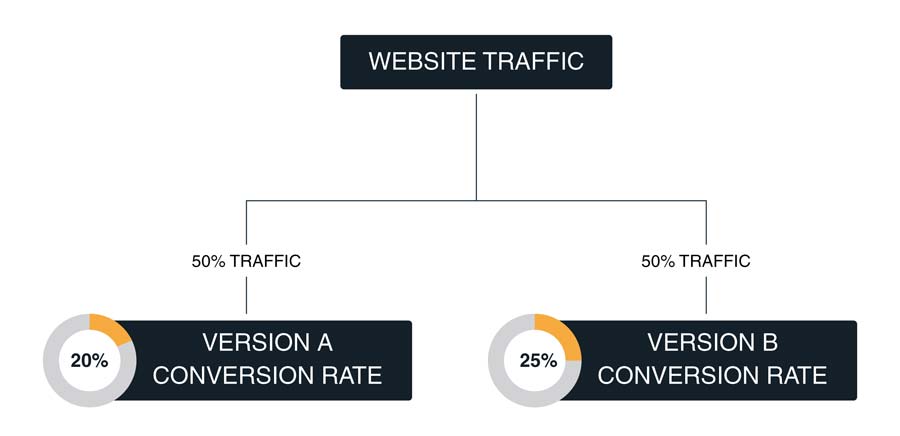
This method is known as split testing or A/B testing. It allows you to measure and compare the conversion rate of any changes you make to your site. At the same time, it stops you from making permanent changes before you are sure that those are increasing your sales.
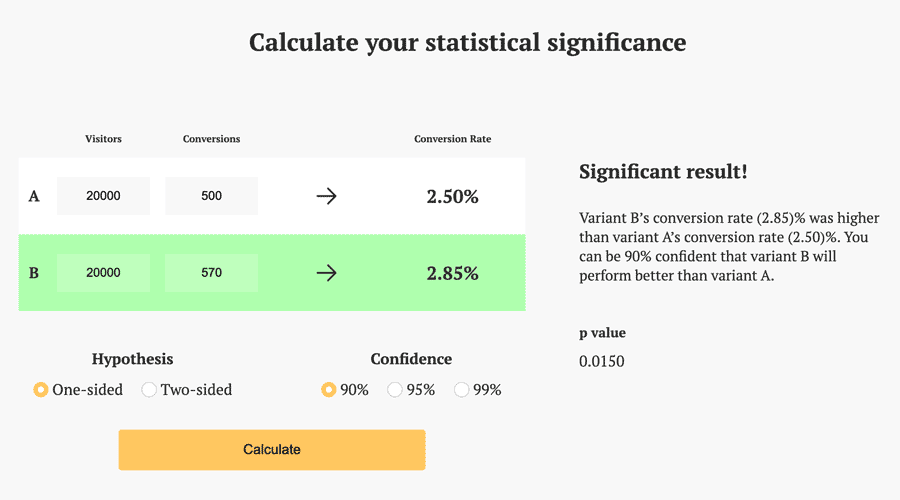
💡Bonus Tip
If you want to conduct A/B testing, make sure your results are statistically significant. You want to reach at least a statistical significance of 90-95%. You can test your results with my free A/B testing calculator.
2. Use High-Quality Images
Which product would you rather buy?
Option A:
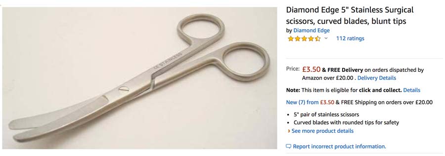
Or Option B?
When it comes to online shopping, your customers can’t touch or feel your product. They have to rely on your product description and product images to make their buying decision.
That’s why it is super important to serve your visitors with high-quality images so that they can get a better understanding of the quality and functions of your product before holding it in their hands.
This will not only increase your conversion rate but also reduce the number of customer returns.
A high-quality product image meets the following criteria:
- It shows the product that is for sale.
- All the product’s features are visible.
- It has a resolution of min. 1,000 pixels.
- It does not contain any logos.
- It uses JPEG (.jpg), TIFF (.tif) or PNG (.png) file formats.
💡Bonus Tip
Use 360° images of your products to let users view your product in detail from all angles.
3. Explain Your Product’s Value
If you want to increase the conversion rate of your ecommerce site, you not only need good looking images. You also need to write compelling copy to outline the value of your product’s benefits.
But where do you begin?
With the customer.
The following graphic outlines the conversion funnel through the eyes of your potential buyers.
They want to know:
- What do you do?
- Why should I care?
- How do I believe you?
- Where do we begin?
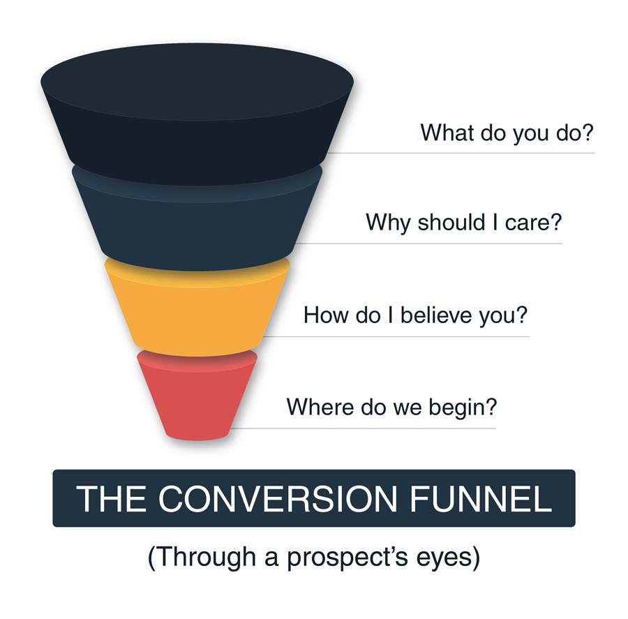
Your site’s copy should answer all of these questions, as soon as a customer lands on your product page.
Let’s take a look at the website of Transferwise:
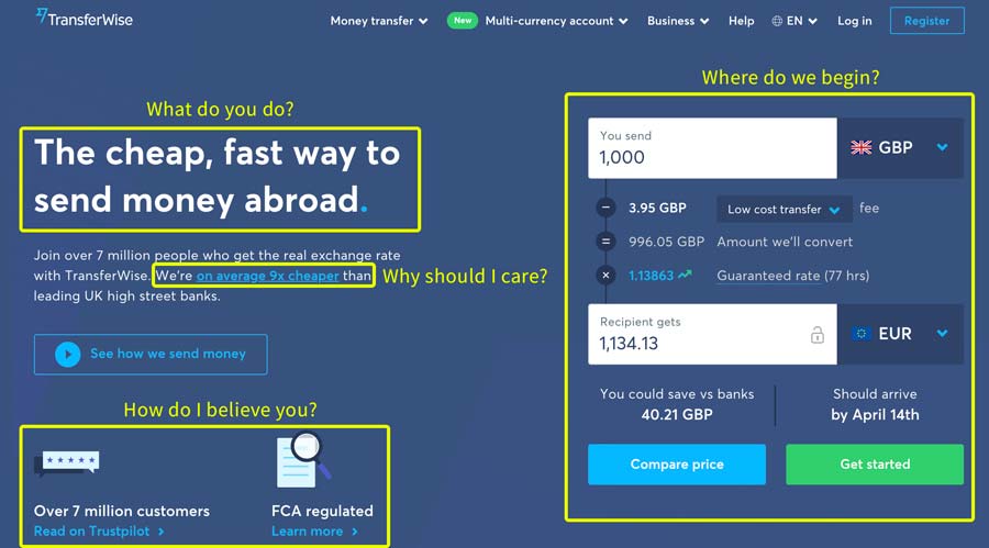
They don’t waste any pixel space before telling you what they do: Offering cheap, fast money transfers abroad.
And they also give you an instant hook why you should care about them: Because they’re 9x cheaper than any other bank.
The smart thing about their homepage is that they not only showcase customer reviews and their FCA license but also let you calculate the exchange rate for your next transaction right away.
The bottom line?
Tell your online shop visitors what you do and why they should care. Back that up with customer reviews or other certificates to prove that customers can trust you. And lastly, give them a steer where to begin their shopping journey with you. This will greatly increase your conversion rate.
4. Use Prominent CTAs
The attention span of your site’s visitors is short. Very short. In fact, the average time of buyers paying attention is around eight seconds.
That’s why the call-to-action (CTA) elements of your ecommerce site need to grab the attention of your visitors right away.
How do you do that?
By optimising the location, design and copy of your CTA elements.
Location
The best location for a converting CTA is a widely discussed topic. Many argue that you need to explain your product first before placing any CTA button.
However, that assumes your customers are not ready to buy your product. But what if you sell hand creme of a widely known brand? Your customers simply want to get a new bottle, as they have used this product already in the past.
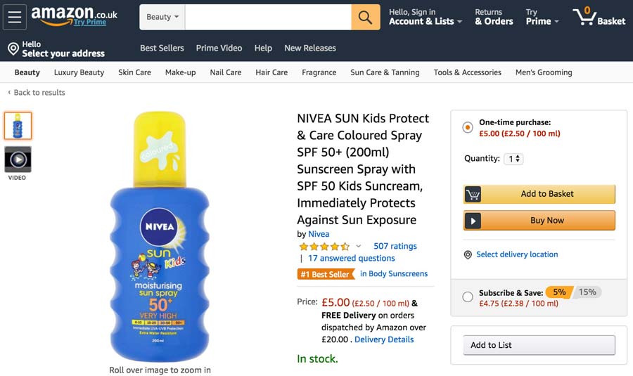
Whether your customers know the product you’re selling or not: If you want to increase your conversion rate, your CTA should be visible right after a visitor lands on your ecommerce site. That’s why you need to place your buy buttons above the fold, i.e., the website area a visitor sees without scrolling.
Take a look at Amazon. Their desktop and mobile site have the buy button visible without scrolling. As soon as a customer is ready to order, they can simply click the buy button without searching for it.
Design
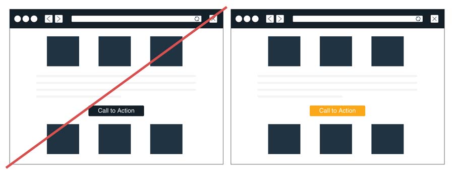
The design of your CTA buttons should draw the attention of your buyers right away.
There is no exact answer to which colour will convert best on your ecommerce store. You’ll have to experiment a bit to find the colour that works for you and your customers.
However, you will achieve the best results, if the CTA elements stand out from the rest of your site’s design and are in contrast to any surrounding text.
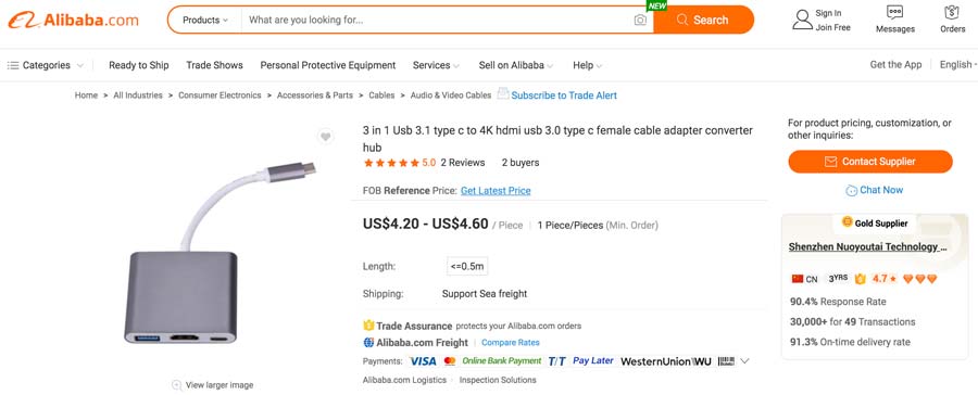
Take the example of Alibaba. Their orange search and contact buttons can’t be missed:
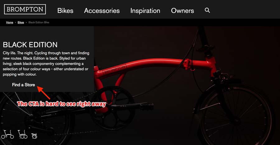
An example of how NOT to do it is the website of Brompton bicycles. Their CTA button “Find a Store” is nearly invisible. It is hidden beneath the surrounding text.
Copy
Whenever you want your customers to take action, you need to give them clear instructions. The less they have to think, the higher are your chances of converting them the way you want.
That’s why you need to make it super simple for them.
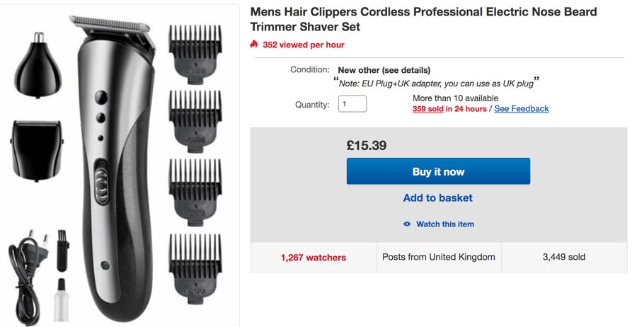
Avoid words like “Submit”, “Add”, or “Sign Up” in your call-to-action elements, as they are ambiguous.
Instead, use copy that makes it crystal clear what happens when customers click a button, such as “Add to basket”, “Buy it now”, etc.
5. Answer Frequently Asked Questions
Your buyers have questions. And no time to read all the information your marketing teams have carefully printed on your product’s landing page. That’s especially true if you sell commodity items, i.e., when customers don’t really care from which brand they buy the product.
And if your users don’t find the answers to their questions in a split of a second, they’ll simply abandon your site. So how can you give them the insights they need in a quick and easy way?
By offering a FAQ section on your product detail pages.
![]() Pro Tip
Pro Tip
If you already have a couple of customer reviews, search for common questions your buyers try to answer and include them in your FAQ. That way, you can identify any concerns your potential buyers might have, leading to higher conversions.
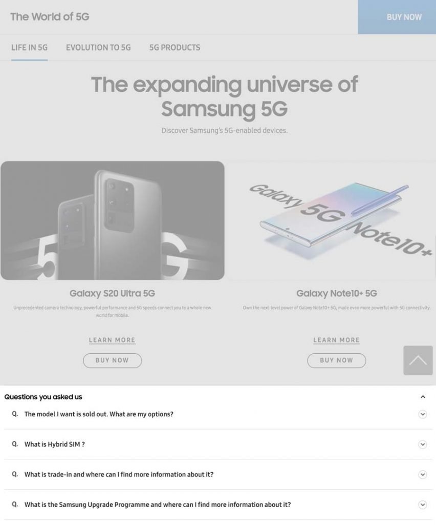
Here’s an example of how Samsung does it in their online store:
6. Simplify Your Checkout Process
Nobody wants to spend a lot of time registering a user account.
Some users simply want to buy a single pair of t-shirts. And they will abandon their cart if you force them to sign up to your site. With disastrous effects on your ecommerce conversion rates.
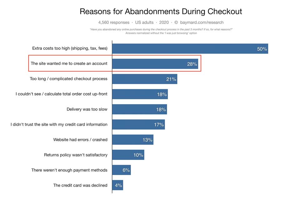
In fact, the need to create a user account was the second most stated reason when customers were asked why they abandon their cart during the checkout process:
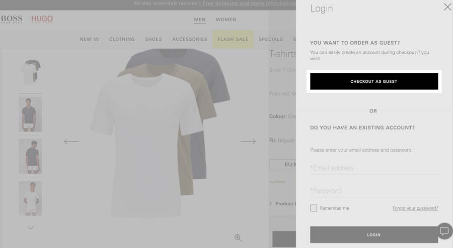
That’s why many online shops are now giving their users the option to checkout as a guest. They only ask for the information they need to fulfill the order. This includes the name, email, shipping and invoice address and credit card details.
Always remember: User experience comes first. If somebody buys from you often, they will eventually sign up for an account.
Plus, even the guest checkout option will leave you with the user’s email address that you can use to bring them back to your store in the future.
7. Use Odd Pricing
As a category leader for fast-moving consumer goods at Amazon, I have seen it countless times: A price difference of only a few cents can decide over the sales performance of a product.
Sure, you can sell your product at a price point of, for example, $12.00 or $12.14
But a price point of $11.99 or even $12.49 will convert up to 222% better, according to studies from the University of New Zealand.
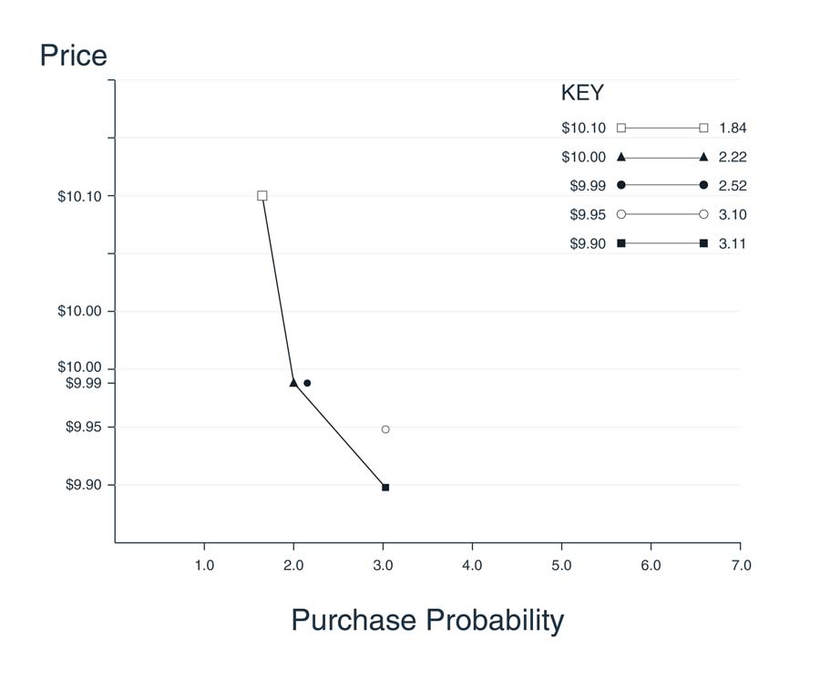
The effect of odd pricing on the demand curve for chocolate, for example, increased the buying probability by over 68%:
That’s why the tactic of odd pricing has been widely adopted. Take a look at the deals page of Amazon:
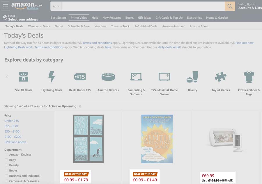
Every single product is offered at an odd price point. Because consumers perceive a price of $0.99 as significantly lower than a price of $1.00.
Think about it: A $0.01 difference will likely have no impact on your margins but can help you to increase your conversion rates by over 200%!
Now, be careful here. Your potential customers will still compare your offer against similar products in the market segment. That’s why you need to ensure that your odd price point also remains super competitive on a dollar level.
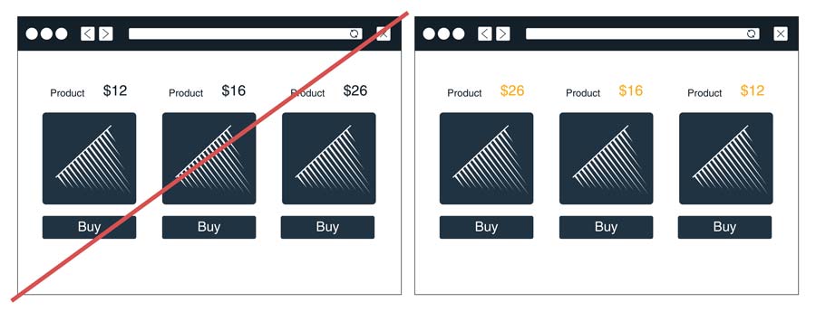
8. Deploy Price Anchoring
The price anchoring effect takes advantage of the fact that consumers rely too heavily on the first price point they see when making buying decisions.
It serves them as a reference to gauge whether the price of a product can be considered acceptable.
Here are some ways you can use price anchoring to increase your ecommerce conversion rates:
Display a higher price first
Many studies have found that if customers are presented with a higher price first, they consider a similar, but cheaper item as the better deal. The first price became the anchor for their future price evaluation and lower-priced offers appear to provide better value.
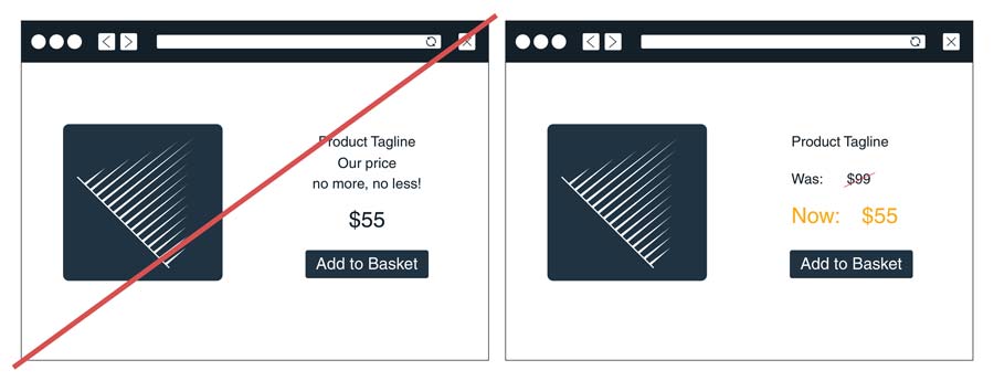
Show the price before discount
When you reduce the price of your products, always make sure you give your users a reference to its original price point. This will serve as an anchor and will underline the value of the product’s sale price.
9. Make Use of Customer Reviews
According to a study from the Spiegel Research Center, nearly 95% of shoppers read online reviews before buying a product or service online. And over 91% trust online reviews as much as personal recommendations.
That’s why, if you want to optimize your conversions, you need to have customer reviews on your site.
Let’s take a look at the following example of a customer review I found on Amazon for a 5-piece knife set:
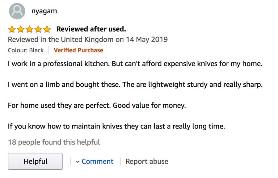
The customer not only praises the low price point, but also the quality and sharpness of the knife set.
Who wouldn’t want to buy the product after reading this review?
![]() Pro Tip
Pro Tip
Customer reviews are also a great place to spot any complaints that might stop others from buying your products. So keep a close eye on them. They will give you insights that can help you build a better customer experience.
10. Use Personalisation
Many studies have shown that over 80% of consumers are more likely to make a purchase when offered with personalised experiences.
Think about it: A dog owner is unlikely to be interested in buying cat food.
If you want to increase your ecommerce conversion rates, you can’t offer the same products to everyone.
Instead, you need to create offers that are based on the personal preferences of your buyers.
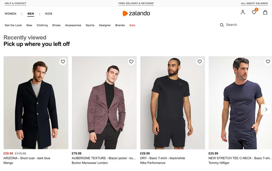
From your homepage to your product detail pages. There are many ways you can make the shopping experience on your site more personal.
For example:
- Display recently viewed items,
- Show related products,
- Offer discounts on a user’s birthday,
- etc.
11. Use Urgency and Scarcity
Another tip that will increase the conversion rate of your ecommerce site is to create a sense of urgency around your offers.
Many studies have found that people assume that if there is less of something, it must be higher in demand. And therefore be of higher value.
Communicating scarcity is a widely used marketing method that you can also use to boost your ecommerce sales. It makes your customers take action.
Here are a few examples that will work like charm:
- Limit the time of your offer (“Today only!”)
- Limit the number of available products (“Only 100 units left at this price.”)
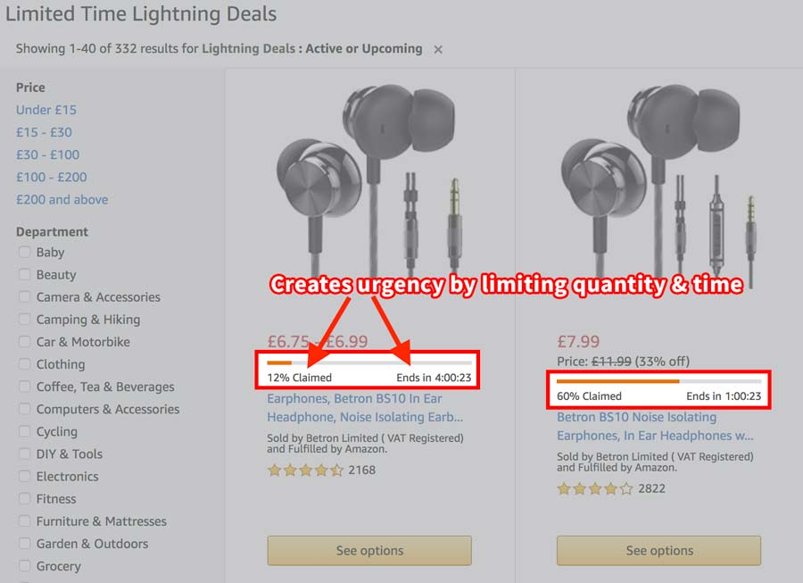
- Communicate the number of products in stock (“Only 14 left in stock.”)
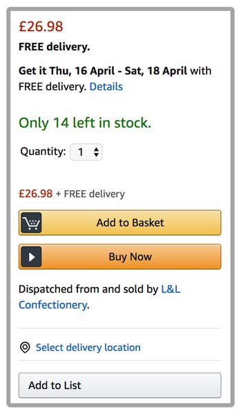
All of the outlined methods create a sense of urgency to make that purchase. The fear of missing out on a great deal, also known as “FOMO”, can really do wonders to your sales. And correctly applied, it is a powerful tool to increase your ecommerce conversions in no time.
Over to You
Now I’d like to hear from you! Which of the tips from this list will you try out today? Or maybe you have a tip that I didn’t cover here.